News / Andrea Pompili
Andrea PompiliFood is Art: Tuorolo Blue and Miracle Noodle

Art, fashion, and food come together in our culture daily. This intersection has been discussed and trending in magazines and blogs since 2017. Food is such a personal decision. It impacts our health, and how we feel. It only makes sense that art would come of it.
Introducing Ryan Bruss and his collaboration with Andrea Pompili and their project Tuorlo Blue. Tuorolo Blue is a collection of photography featuring Miracle Noodle.

To celebrate this unique and intriguing project, Miracle Noodle is happy to announce our Food is Art challenge! Launching September 22nd – October 22nd. Details on entering follow the interview.
Some details on our artist friends:
Andrea Pompili - graduated from the Academy of Architecture, USI, Switzerland, and began her career in the film industry working with Prof. Marco Müller (2004-2011 Venice Film Festival Director) for the Master Class Styles and Techniques of Cinema at USI. She then worked with Luca Guadagnino on Suspiria as the production design assistant. Three years ago, she moved to Tokyo and started her career as an architect at Sou Fujimoto & Architects before moving to Kengo Kuma And Associates where she currently works.
Ryan A. Bruss - Ryan has been living and working as a photographer for 15 years in Tokyo. Working primarily in fashion, jewelry, and product photography he has worked with Ralph Lauren, Mercedes Benz, & VOGUE. In addition, Ryan has M.A. in cognitive linguistics and explores visual and linguistic metaphors of Japanese culture as a Professor of creative writing. His work can be found at Ryanbruss.com.
Here are Miracle Noodle, we were intrigued and delighted that Ryan and his creative partner Andrea wanted to work with Miracle Noodle as a subject in their project. We set out to ask them some questions.
Ryan, You’re a photographer that has worked in portrait and fashion. Andrea, you’re an architect, artist, and philosopher. How did you two come together to make a project that ties architecture, food, and together?
As everyone else, we were very shocked by the way the world changed with COVID19 and it had a huge impact on our daily lives. Suddenly spending so much more time at home and cooking, we used the situation as a way to explore and create using our kitchen. The isolation really was an amazing opportunity to explore the culinary realm through our individual specializations. I am a huge fan of Edward Weston`s still-life photography of shells and peppers and this project was a beautiful way to bring me back to why I originally got interested in photography as an art form. For Andrea, food is a unique medium for her to design with that is very different from the mediums architects usually work with such as cement, steel, and wood. This allows her to explore her sense of design in new ways.
Why is the project names Tuorlo Blue?
We choose the name TuorloBlue to lexically enhance the merging of our different nationalities - Italian and American -.
Tuorlo in Italian literally means “yolk”. As the image of egg in many cultures symbolizes a new beginning, a new life, our philosophical approach is based on the image of a new creation.
Blue is the color of the main two natural elements that symbolize life: water and sky (air). It is also one of the rarest colors in nature. Indeed, when it appears in animals it is due to the structure of the molecules and the way they reflect light. As Nature uses often pure physical phenomena to create blue, our approach to the creation of our images is also an elaborated process that involves light and lens.
This unique aspect of the color Blue also enhances the idea of a new natural-artificial creation and this is exactly our approach to our culinary creations: all based on natural ingredients combined in new innovative ways in a sort of “artificial” alteration of the experience of them.
Our approach is indeed an intentional exploration of the uniqueness of textures, patterns, colors, and flavors of natural ingredients.
Also the visual image of a yolk can be seen as a rising sun, a symbol of Japan, the country where the Tuorlo Blue project started.
For our logo, the 5 lines in the Tuorlo Blue logo represent the geometric pattern of Karesansui (Japanese zen garden). In Numerology Theory, the number 5 is the number of balance and harmony further enhanced by the zen garden imagery of the lines. The symbol of egg, that already embodies perfection, is here overpowered by the number 5.
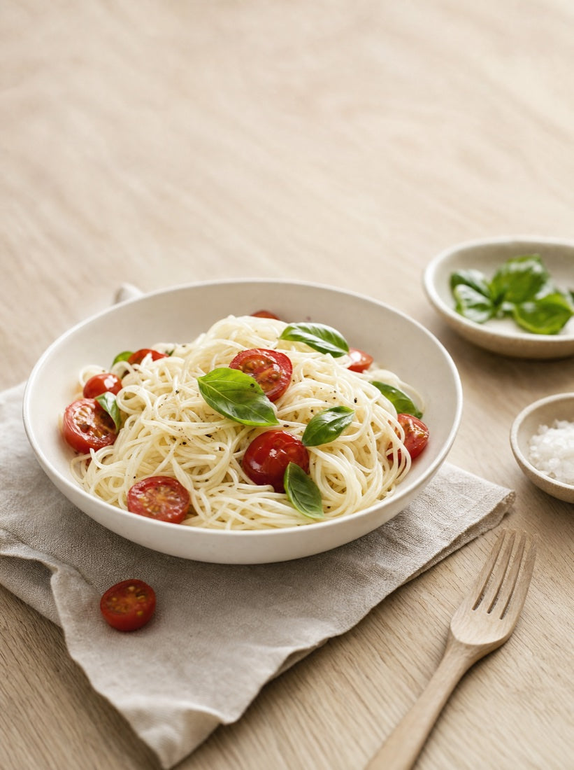
For the project Tuorlo Blue, what led you to work with shirataki noodles versus another medium?
We are both world travelers and love experiencing different cultures while fusing these experiences with our native cultures. There is no shortage of Italian restaurants, recipes, and cooking blogs so we wanted to take a new approach in combining this rich Italian cultural culinary heritage with a Japanese influence. We both live and work in Tokyo and found these noodles a perfect fit with creative Italian recipes. Beyond the cultural aspect, it was amazing to be able to enjoy typical Italian dishes such as carbonara with a small fraction of the calories. With COVID19 it has become even more difficult to stay fit, and these noodles were a perfect solution to cutting calories, lbs, and feeling light after a meal of pasta.
What are some of the biggest challenges in creating recipes that translate to art?
We started off with traditional recipes but quickly moved on to our own unique creations so there is definitely a bit of risk and experimentation. The biggest challenge is balancing the taste, health, and the visual design of the dish. It is a great pleasure, however, as neither of are chefs so we don’t know what the limits are and love to try new things. In terms of plating the final dishes, we rarely end up following the plan but often are forced to improvise. Recently we made a dish that the sauce turned out to be brown instead of the desired purple, so we followed that direction and added cinnamon to the recipe. By adding cinnamon to the dish that already had edible flowers, the brown sauce, and shirataki rice suddenly looked like an elegant bed of flowers. The improvisation of the cinnamon not only redefined the look of the dish but also added a unique twist to the flavor which had a base of blue cheese & eggplant.
Are you enjoying the taste-testing process? If so, please describe your favorites so far from the project.
We love shooting and creating these recipes and then getting to experience the taste… which is always new as these are recipes we have never made before. My favorite dish so far was Midori Garden. I had never had shirataki rice before, nor am I a big fan of peas which we used for the sauce. I couldn't stop eating it. The rice really works well with the texture of shirataki, it feels almost a bit like tapioca. I am very excited about using shirataki rice in the future with recipes as I think this combination is ideal and very underused as an ingredient. The pea-based sauce complimented the feel of the shirataki rice perfectly, with a light and subtle taste that was very addicting. Luckily, it was also a dish extremely low in calories mainly consisting of shirataki, peas, black garlic & a bit of olive oil.
On your recipes page, you include some very detailed illustrations that harken to blueprints. Who is behind the illustrations and how are they being made?
Andrea is an architect and in her profession, she uses 3D modeling software on a daily bases at Kengo Kuma Architects & Associates. The architectonic mindset was behind the idea of explaining recipes through architectural illustrations. She 3D models each recipe and then creates illustrations based on the aesthetic of blueprints used to create the architectonic drawings for plans and elevations. This scientific aspect to the drawing is also the aesthetic that Andrea used to create a new collection of dishes for Tuorlo Blue all Made in Italy (made in Faenza, the Italian capital of Ceramic), displayed in Italian interior design showrooms and also shortly on sale on TuorloBlue.com.
What do you hope to accomplish with your project?
Our first goal with the project is to simply enjoy & refine our crafts, developing as a photographer & architect while enjoying unique taste experiences at the same time. Through our passion, we hope to introduce more people to healthy and low-calorie recipes that shirataki makes possible. Food is certainly functional, but can be so much more. We also hope to introduce this aspect of cooking from the perspective of two people who are not chefs, of art, plating, and visual experiences that complement and enhance the taste of the dishes. We are what we eat, and this is the only art form in which the art is literally absorbed in yourself and reflected in your mind & body.
We are also using Tuorlo Blue as a way to create art projects that complement the culinary experiences we are presenting. From the photography aspect, we have several gallery shows being planned in Italy and with the Italian embassy here in Tokyo. For Andrea, she has developed a beautiful line of plates with already 30 unique designs that have been made and are currently being sold in her home town of Cesena. These plates feature illustrations similar to those on our site, but also original structures that are designed by Andrea and handmade in Faenza, the capital of ceramics in Italy.
As you two know, we are launching a Food is Art challenge to our followers on Instagram. What are your tips for budding food artists and photographers?
For photography… experimentation is essential. Each shoot I am constantly learning and trying new techniques. Some people ask me about iso, f-stops, shutter speeds…. all of these things are just tools for the effects that you want in your images. Constantly play with the light & framing until you find something that presents the subject in a dynamic way that speaks to its nature.
Creating food art, like any art form, is an act of pure creativity starting with just a blank plate in front of you. You can have a general idea and plan, knowing the taste of each individual ingredient, but the great beauty of art is following your instincts and creating as a reflection of self, in the moment adapting and exploring. The beauty and possibilities provided by nature alone are limitless. One of our most striking recipes visually is Optical Octopus which was created using red cabbage (used to dye the octopus purple) and orange tomatoes. The combination created a visual experience that at the same time was healthy.

About the Challenge: Food is Art

To enter the Food is Art challenge, check out the photos at www.tuorloblue.com and check out the Instagram page at TuorloBlue.
Create your own artistic interpretation of Miracle Noodles in a meal. Post your entries on your own Instagram account. Make sure to tag @miraclenoodle and use the hashtags #miraclenoodle and #miraclenoodle. Entries are being accepted from September 29th – October 29th.
The winner will have their creation announced and promoted on our social media channels and win a month's supply of Miracle Noodle!